 AppScreenshots Docs
Device frames
Select, populate, and refine realistic device mockups or CSS device frames in a screenshot project.
Use device frames without hiding the product
A device frame tells viewers where the experience lives. It is not the product itself: the screen inside must remain large, current, and easy to inspect.

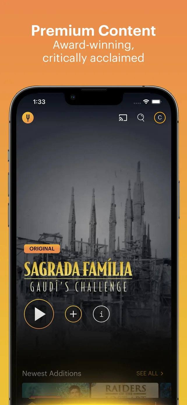
Current English template-preview reference. The phone shell provides context, while the app screen remains the visual proof; use the same balance in your own frames.
Choose a frame style
Open Devices in the Screenshot Editor. The panel offers two modes:
| Mode | What it contains | Choose it when |
|---|---|---|
| Real Device | Realistic device assets grouped by iPhone, iPad, Mac, Apple Watch, Android, and display categories | The physical product and hardware context contribute to the story |
| CSS Device | Configurable iPhone, iPad, Android, HarmonyOS, and browser frames, including standard, 3D, handheld, and custom styles where available | You need a clean, graphic, or more adaptable mockup treatment |
The list is maintained in-product, so select the available model that best matches your approved target rather than relying on a static model list in documentation.
Add the screen correctly
Add and select the device
Choose a device from Devices. It is added to the active frame. Click it on the canvas to open Device Properties.
Upload or replace the app screen
Use Upload Screenshot. Once an image is present, the same area offers Replace and Remove. Keep the original capture available in project assets so a later build can be swapped in quickly.
Refine the treatment
Use device properties to choose the device type, color, available 3D angle or handheld style, then set size, rotation, position, and layer order. Make the device large enough to show the UI rather than the hardware.
Match the device to the delivery plan
| Delivery context | Recommended approach |
|---|---|
| iPhone or iPad listing | Use source captures from the intended device class and a matching device treatment; verify the required canvas dimensions in the destination store. |
| Android listing | Use a clean Android source capture and an Android-compatible device treatment. Do not use an iPhone shell merely because it looks familiar. |
| Browser or extension listing | Use a browser frame and a browser-sized template or canvas; keep browser UI and content readable. |
| Marketing or social asset | Choose the frame that tells the story best, then use Screenshot Resizer to create additional delivery sizes. |
Avoid the four common frame mistakes
- Tiny UI: Scale the device until the relevant interaction can be recognized.
- Wrong proof: Match the screenshot content to the headline, not merely to the device.
- Mixed visual language: Keep hardware style and device color consistent across a series unless contrast is intentional.
- Unsafe cropping: Leave room around the frame for shadows, headlines, and translated copy; review the exported edge, not only the editable canvas.
Cross-frame devices
For a continuous panoramic layout, switch the canvas to horizontal layout, enable continuous mode, select the device, and enable Frame Spanning in Device Properties. Select how many frames to span to the right. This is a design effect—not a replacement for individual frame readability.
Continue with Design with elements and backgrounds or Export screenshots.