 AppScreenshots Docs
Design with elements and backgrounds
Create clear visual hierarchy with text, backgrounds, devices, images, icons, shapes, and reusable assets.
Design with elements and backgrounds
The editor gives you many ingredients; a strong screenshot uses only the ones that make the product easier to understand. Build from the message outward, not from decoration inward.
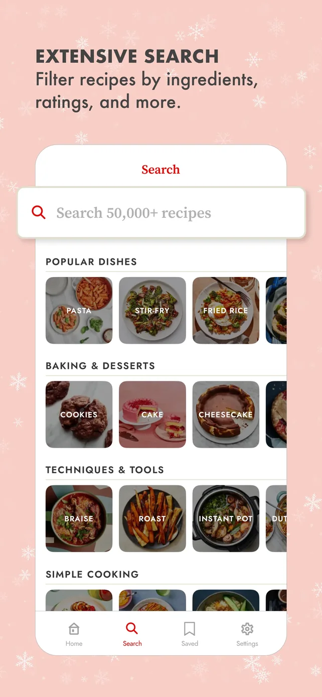
Current English template-preview reference. The screenshot combines the four layers described below: message, product proof, supporting cue, and brand atmosphere.
Use this visual hierarchy
| Priority | Purpose | Typical treatment |
|---|---|---|
| 1. Benefit | Tell the viewer why this frame matters | One short headline with high contrast |
| 2. Product proof | Show the relevant UI state | A real screen in a device, large enough to inspect |
| 3. Supporting cue | Direct attention or add context | Small icon, badge, callout, or short supporting line |
| 4. Brand atmosphere | Make the set recognizable | Background color, gradient, illustration, or subtle pattern |
If a decorative asset makes the headline or product screen harder to scan, remove it.
Add and edit text
- Open Text and choose Add Text.
- Select the new text on the canvas.
- In Text Properties, use the Content, Font, and Color tabs to set wording, typeface, size, weight, alignment, line height, and color.
- Use the panel’s layer controls if text needs to move above another object.
Keep headlines short enough to survive translation. For a multi-line headline, verify its intended line breaks at the final frame size, not only while zoomed in.
Build the background before adding decoration
Open Background and choose one of three surface types:
| Surface | Best for | Watch out for |
|---|---|---|
| Solid color or palette | Product screens with detail, data, or small UI | Avoid weak contrast with the headline or device edge |
| Gradient | A campaign or feature with a simple central subject | Do not use a high-contrast gradient behind small text |
| Image | Lifestyle-led or editorial storytelling | Use a quiet crop; the background should not impersonate product UI |
The image tab can explore stock imagery or accept an upload. Use only assets you are licensed or authorized to use in store marketing.
Use elements intentionally
Elements contains three useful groups:
- Icons: consistent Lucide icons for concise feature cues.
- Images / design resources: illustrations, store badges, gestures, and avatars supplied in the library.
- Shapes / element library: basic forms, arrows, callouts, blobs, patterns, waves, stars, laurels, lines, and dividers.
Select any item on the canvas to adjust its size, opacity, rotation, position, color, stroke, or layer order. For images, use Replace rather than rebuilding the layout when you need a new asset.
Handle brand assets as a system
In Uploads, use the two tabs deliberately:
| Asset type | Store it in | Example |
|---|---|---|
| Project asset | The current project | Release-specific app captures, campaign art, temporary partner logo |
| Brand asset | Your reusable library | Product logo, approved icon, recurring decorative motif |
You can click, drag, or paste image files into either library. The editor accepts JPG, PNG, WebP, GIF, and AVIF uploads up to 2 MB. Selecting a library item can add it to the canvas; with a device selected, it can also provide the screen image for that device.
A repeatable frame recipe
Use this for every frame before inventing a new composition:
- Pick the frame’s one user benefit.
- Place the real app screen where it can prove that benefit.
- Add the headline in clear reading order.
- Choose a background that makes both elements legible.
- Add at most one supporting visual cue.
- Zoom out, remove anything that does not help the first-glance story.
Continue with Choose device frames, Localization, or Export screenshots.