App Screenshot Examples
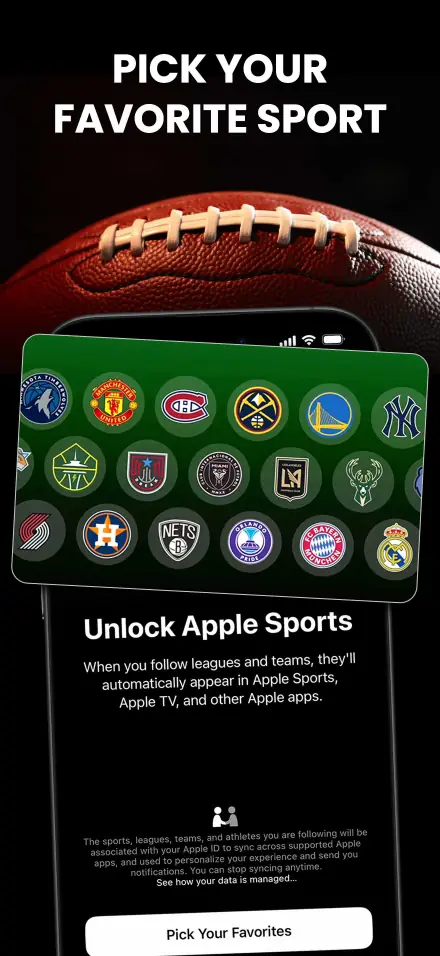
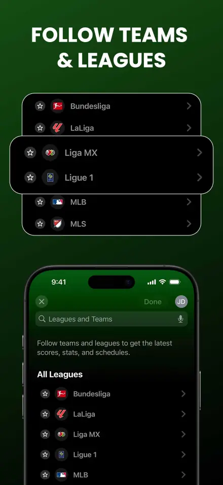
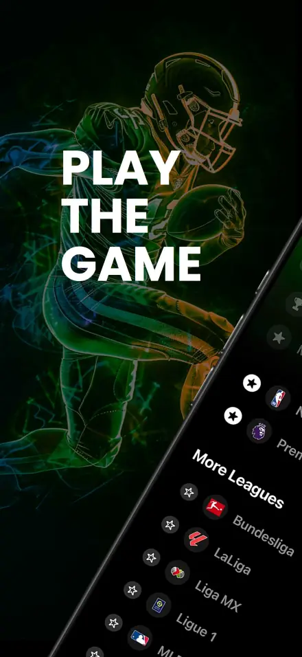
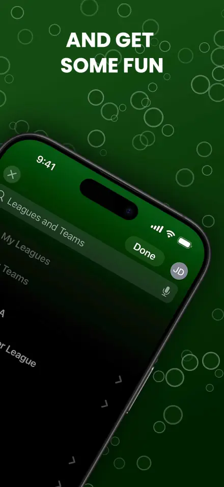
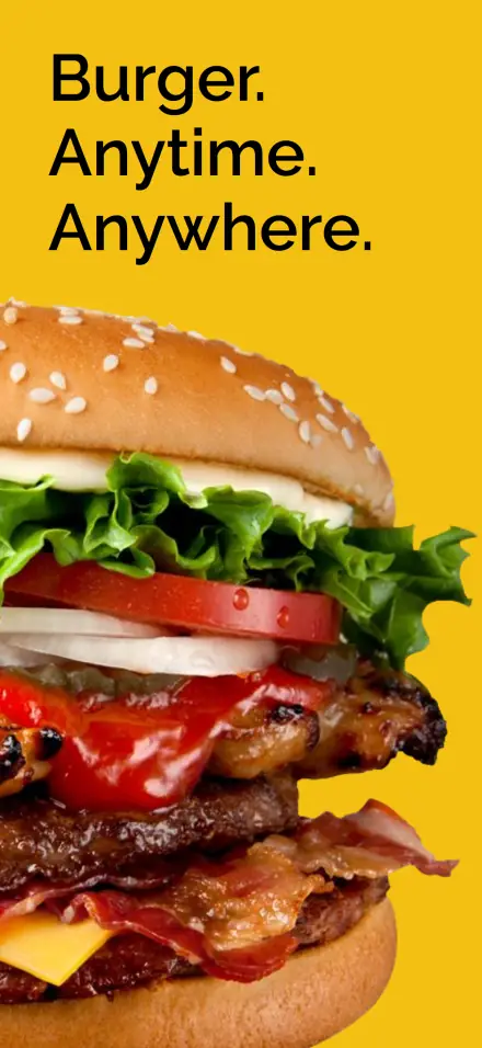
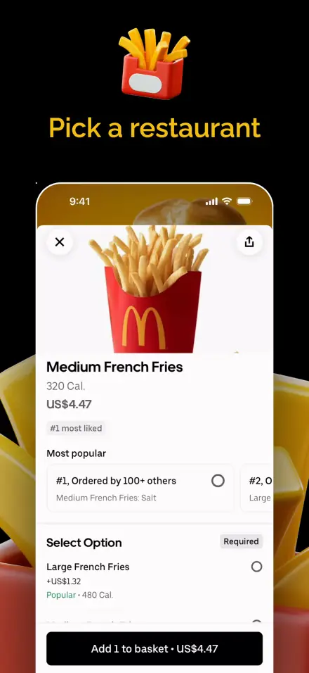
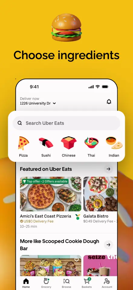
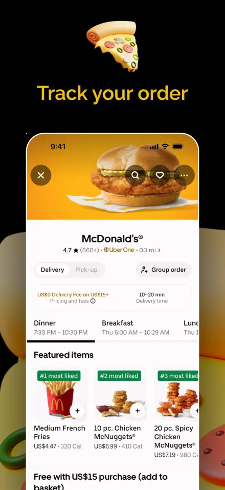
Discover how top apps design their App Store and Google Play screenshots. Get inspired by real-world examples and learn best practices for creating high-converting app store visuals.
Featured App Screenshots
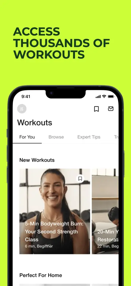
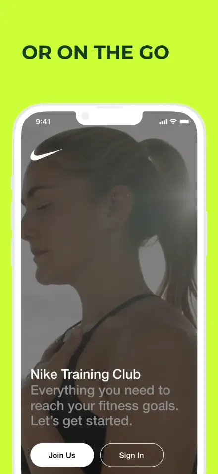
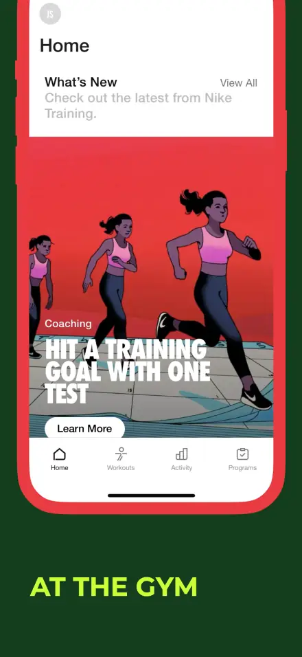
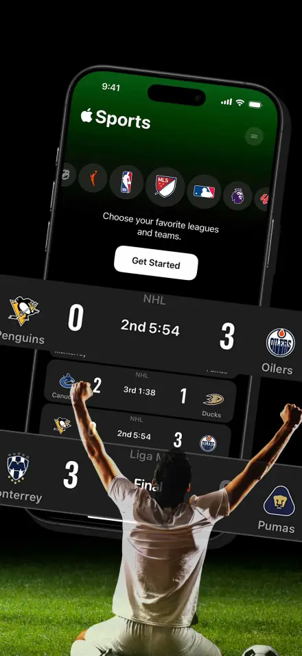
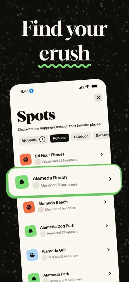
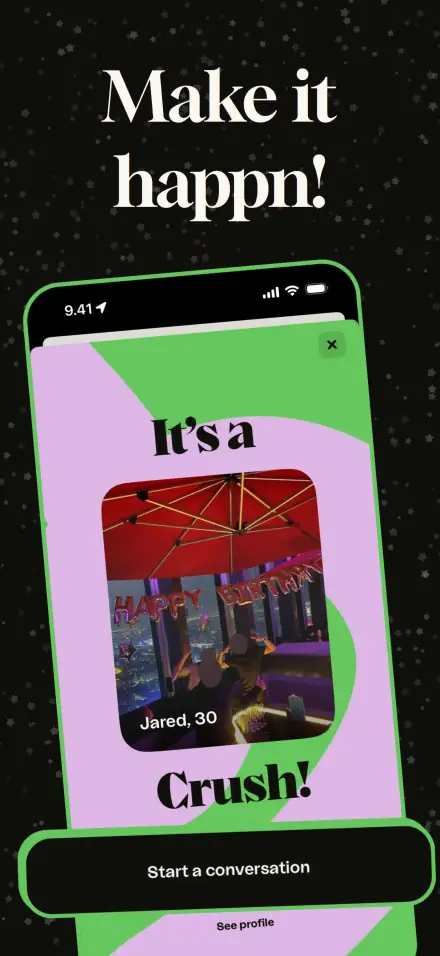
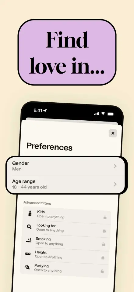
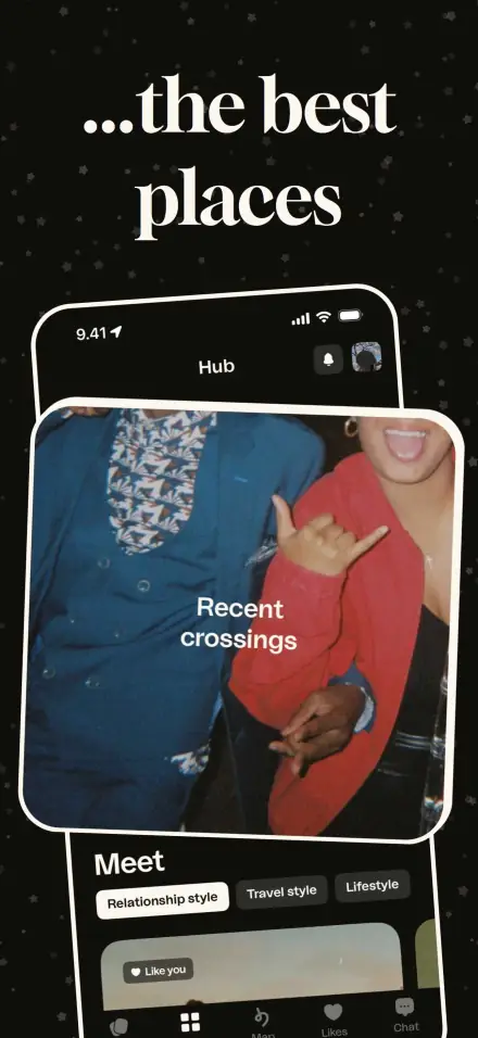
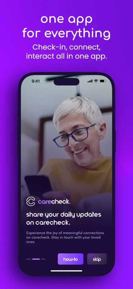
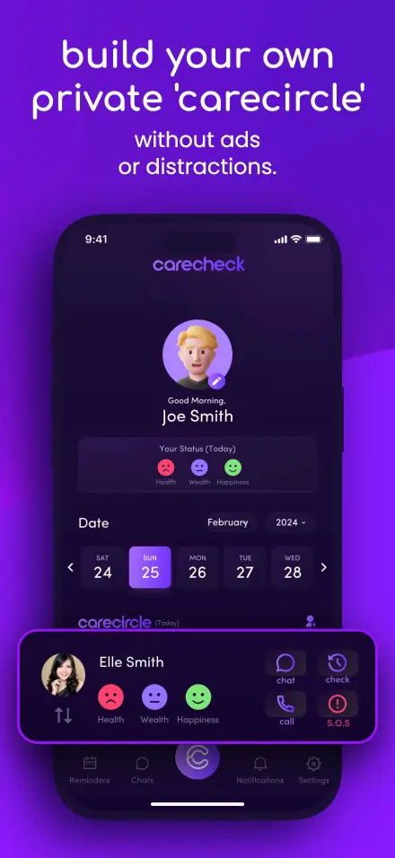
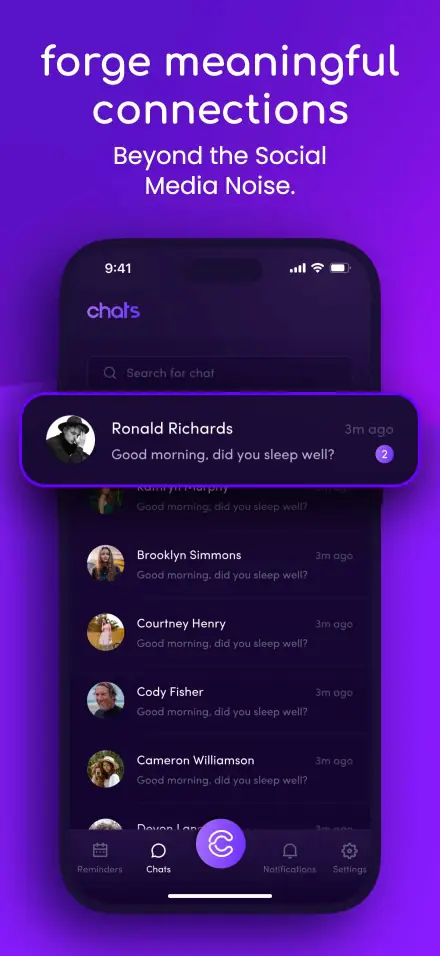
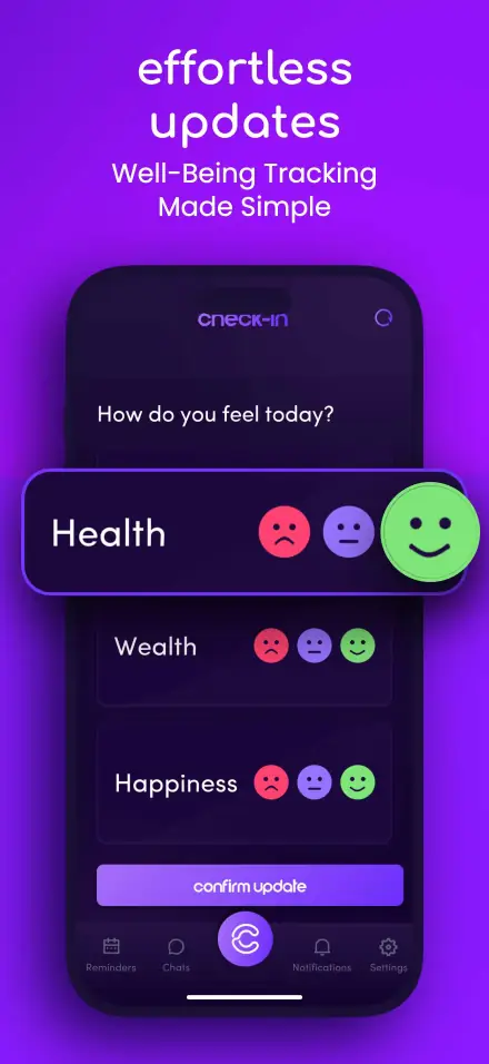
Explore curated app screenshot designs for inspiration. See how professional screenshots can boost your App Store presence.


Screenshot Design Best Practices
Learn from the best. Here are proven strategies used by top-performing apps to create screenshots that convert.
Highlight Key Features
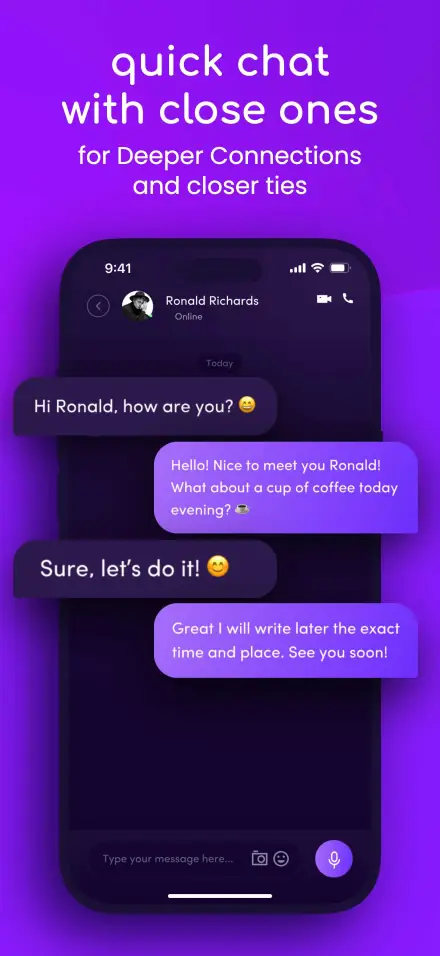
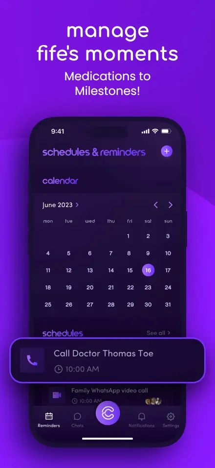
Focus on your app's most valuable features. The first 2-3 screenshots are crucial - they should immediately communicate your app's core value proposition.
Maintain Visual Consistency
Use consistent colors, fonts, and styling across all screenshots. This creates a cohesive brand experience and looks more professional.
Use Clear Typography
Keep text concise and readable. Use large, bold headlines that can be read at a glance. Avoid cluttering screenshots with too much text.
Show Real Device Context
Display your app within device frames to help users visualize the experience. Use the latest device models to appear current and modern.
Include Clear CTAs
Guide users with action-oriented text like 'Track your progress' or 'Save money instantly'. Make benefits obvious and compelling.
A/B Test Your Screenshots
Test different screenshot variations to see what resonates with your audience. Small changes can significantly impact conversion rates.
Ready to Create Your Own Screenshots?
Use our free screenshot generator to create professional App Store and Google Play screenshots in minutes.